C4 Model Architecture Diagrams
Good Architecture Diagrams
What makes a good architecture diagram?
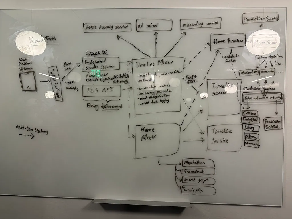
How good is the following whiteboard diagram of the Twitter architecture?1
Simon Brown compiled a checklist for architecture diagrams2 – let’s apply it:
- General
- Does the diagram have a title? ✅ (if we are generous)
- Do you understand what the diagram type is? ✅
- Do you understand what the diagram scope is? ✅
- Does the diagram have a key/legend? ❌
- Elements
- Does every element have a name? ✅
- Do you understand the type of every element? (i.e. the level of abstraction; e.g. software system, container, etc)❌
- Do you understand what every element does? ❌
- Where applicable, do you understand the technology choices associated with every element? ❌
- Do you understand the meaning of all acronyms and abbreviations used? ✅
- Do you understand the meaning of all colours used? ✅
- Do you understand the meaning of all shapes used? ❌
- Do you understand the meaning of all icons used? ✅
- Do you understand the meaning of all border styles used? (e.g. solid, dashed, etc) ✅
- Do you understand the meaning of all element sizes used? (e.g. small vs large boxes) ❌
- Relationships
- Does every line have a label describing the intent of that relationship? ❌
- Where applicable, do you understand the technology choices associated with every relationship? (e.g. protocols for inter-process communication) ❌
- Do you understand the meaning of all acronyms and abbreviations used? ✅
- Do you understand the meaning of all colours used? ✅
- Do you understand the meaning of all arrow heads used? ✅
- Do you understand the meaning of all line styles used? (e.g. solid, dashed, etc) ✅
The diagram is not easy to interpret for outside observers who have not been in the meeting. It’s not clear what each service does and what each arrow represents. Details about technology choices are sparse.
Most architecture diagrams you come across are similarly imperfect.
Simon Brown to the rescue!
C4 Model
Simon Brown’s C4 Model for visualizing software architecture uses a hierarchy of four diagrams:
- The first C – Context – looks at the system as a black box and describes the relations to users and other systems.
- The second C – Containers – zooms in and shows the deployment units the system is comprised of.
- The third C – Components – zooms into one deployment unit and visualizes its logical components.
- The fourth C – Code – zooms into one component and show a classic class diagram of the component. 3
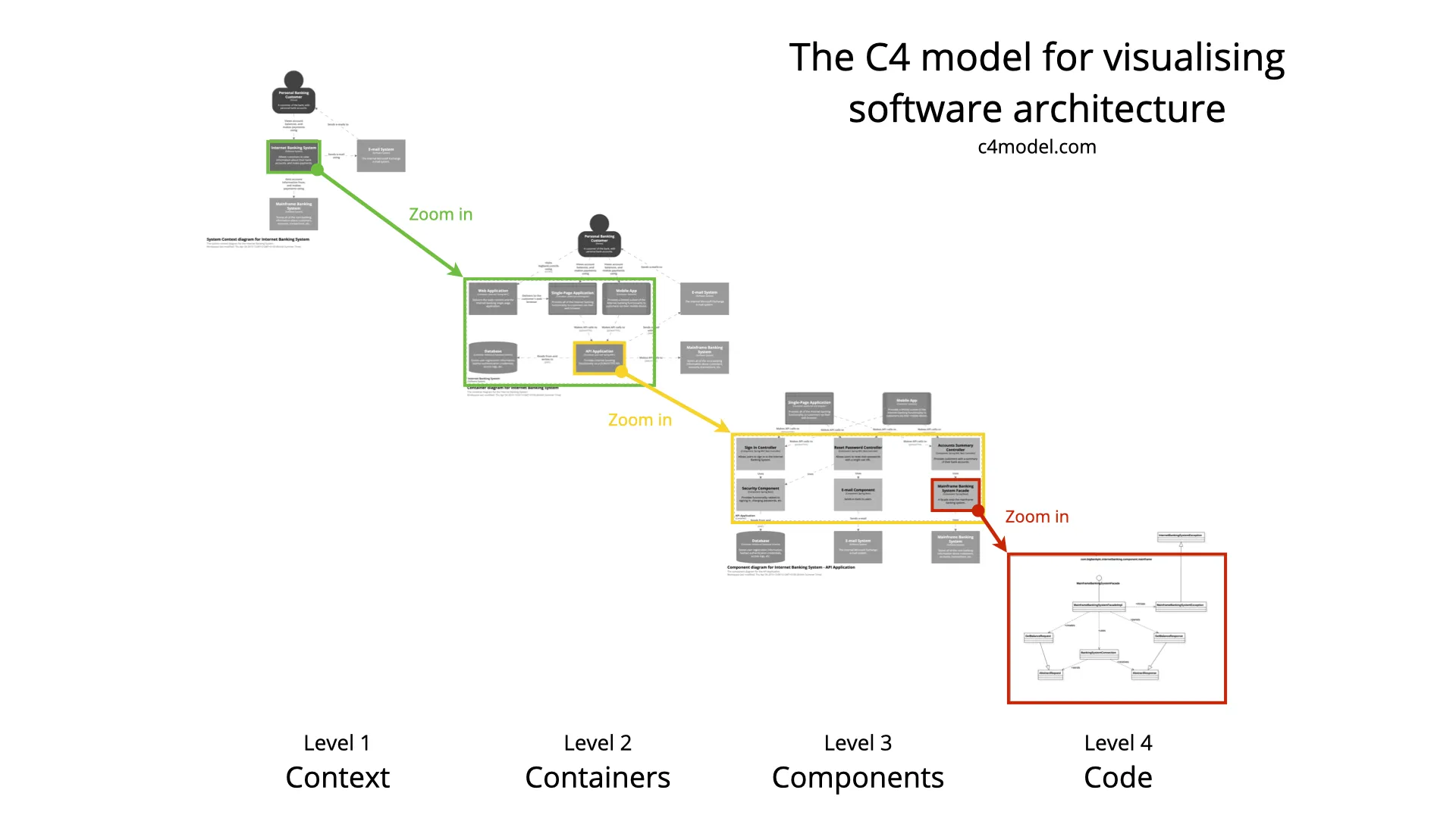
Level 1
The System Context diagram at level 1 shows users, use cases, and how the system relates to other systems. The descriptions of the systems and users, together with the labels for the relations set it apart from most diagrams.

Level 2
A “container” is something like a server-side web application, single-page application, desktop application, mobile app, database schema, file system, etc. Essentially, a container is a separately runnable/deployable unit (e.g. a separate process space) that executes code or stores data. — Simon Brown4
The Container Diagram shows how the system is structured at a high level. What deployment units are there and how do they relate to each other? The diagram includes technology choices.
Compared to other types of diagrams, the vocabulary is simple. There are no different types of arrows or arrow heads, for example.

Level 3 and 4?
There are two more levels but you may not need them.
You might want to look at the rough structure inside select containers.
You might want to generate a UML class diagram for select components.
You might also want to add additional diagrams like deployment diagrams or behavioral diagrams for select flows.
For more details, see c4model.com
Footnotes
-
Twitter whiteboard diagram ↩
-
Simon Brown, c4model.com, A software architecture diagram review checklist ↩
-
Simon Brown, c4model.com, The C4 model for visualising software architecture ↩
-
Simon Brown, c4model.com Level 2: Container diagram ↩